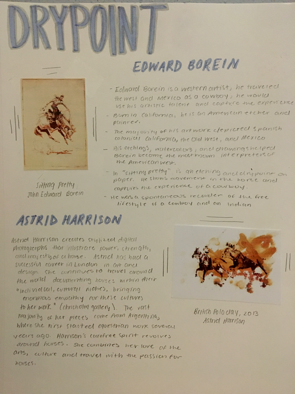
DryPoint
|
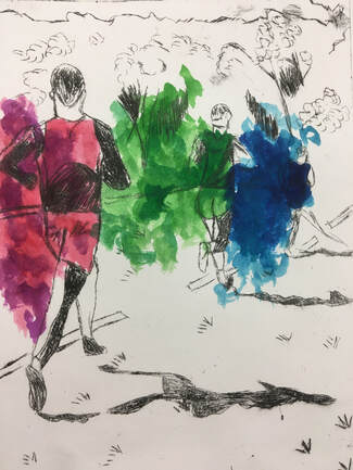
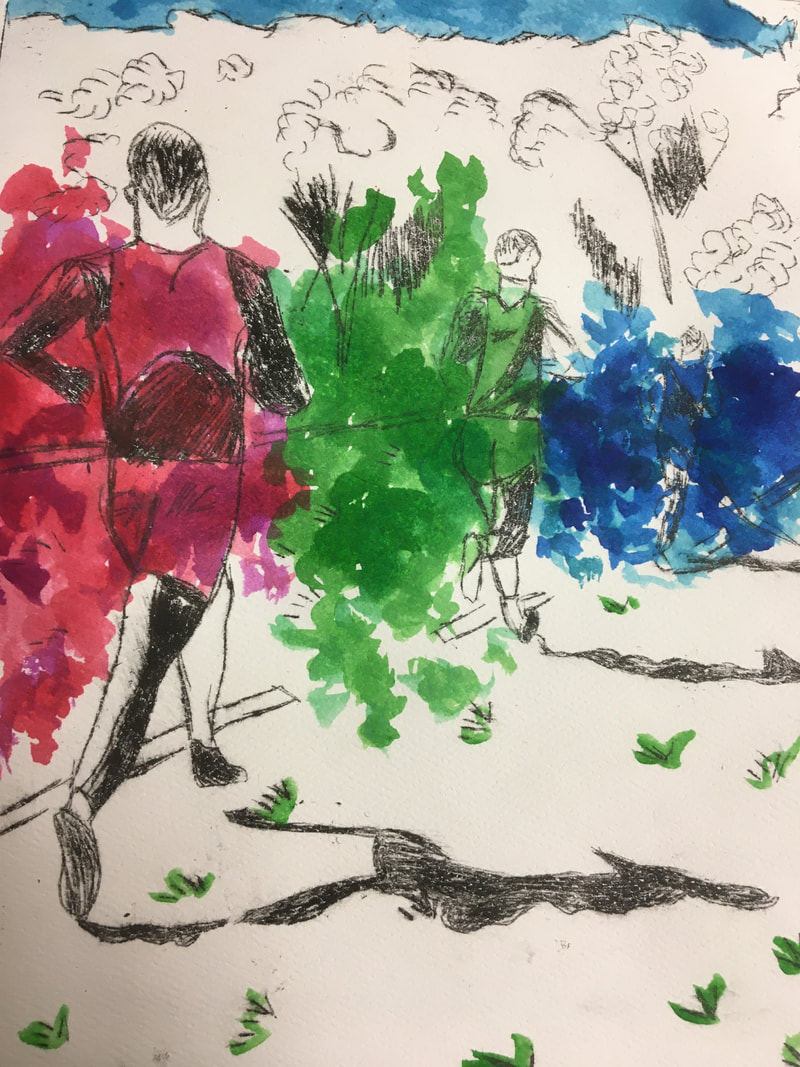
800 Meters LeftSize: 20cmx15cm
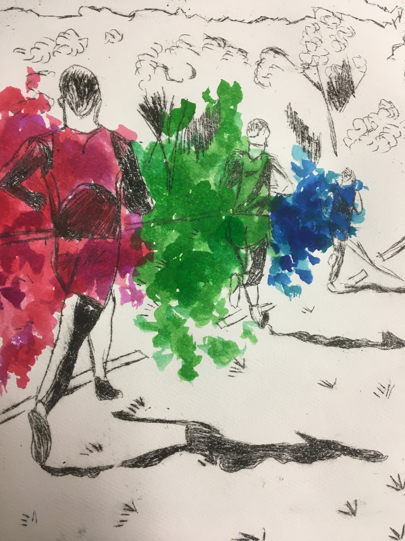
Medium: Dry point Print on Watercolor paper Completion: October 2019 Exhibition Text: 800 Meters Left represents how much strength a runner has to be able to go when there is 800 meters left of a race. My inspiration was Edward Borein who recorded experiences around him with sketches and dry points and Astrid Harrison who used color to represent strength. This piece is a representation of self identity because I focused it on running, which has become an important part of my life. |
Planning
|
Inspiration
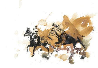
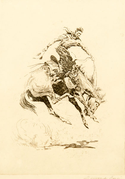
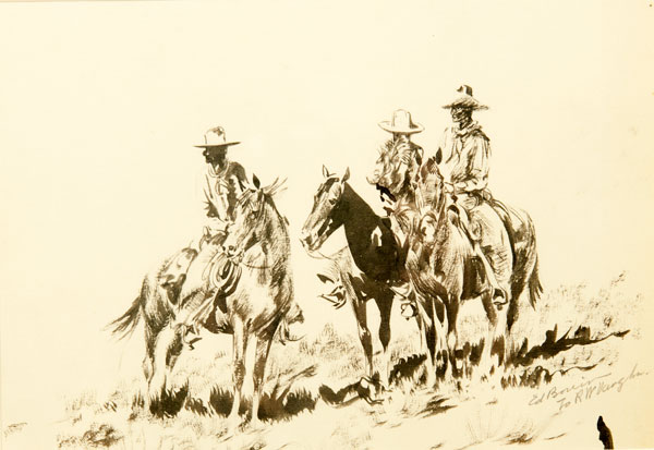
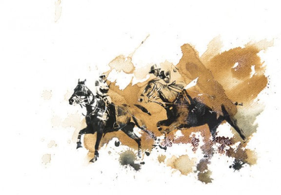
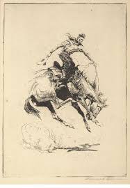
My inspiration was Edward Borein and Astrid Harrison. Edward Borein is a western artist who was born in the West. He would travel the west and Mexico as a cowboy and as he went through this, he would use his artistic talent and capture these experiences. He soon became a spontaneous recorder of the free lifestyle of a cowboy and Indian. Soon, he moved to New York to become a professional artist. He then returned to California and set up a studio in 1921 in Santa Barbara. His etchings, watercolors and drawings helped Borein become the most known interpreters of the American West. I was most inspired by sitting pretty and Three Cowboys on Horse at Rest. I plan to use his style with his etchings with my dry point. Instead of doing horses and cowboys, I plan to use cross country runners to show movement in the way he showed movement with the horses. Astrid Harrison, creates stylized digital photographs that have a powerful illustration of the power, strength and majesty of a horse. Her piece, British Polo Day, inspired me to use color in my dry point. I plan to use her methods of the color in my piece to as a way to show movement throughout the piece but to also show the strength of a runner towards the end of a race. For this piece, I also plan to take pictures to capture the experience of the runners making their way to the finish line. |
Planning Sketches
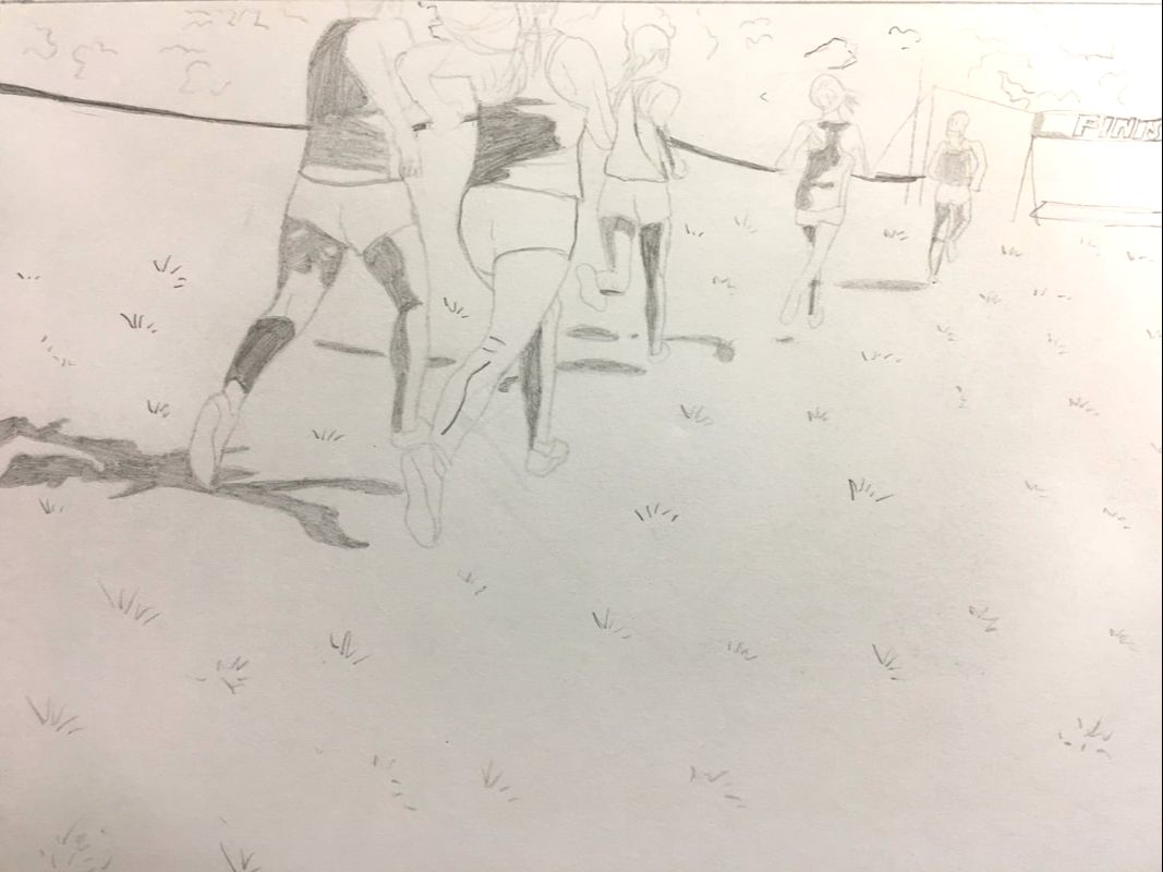
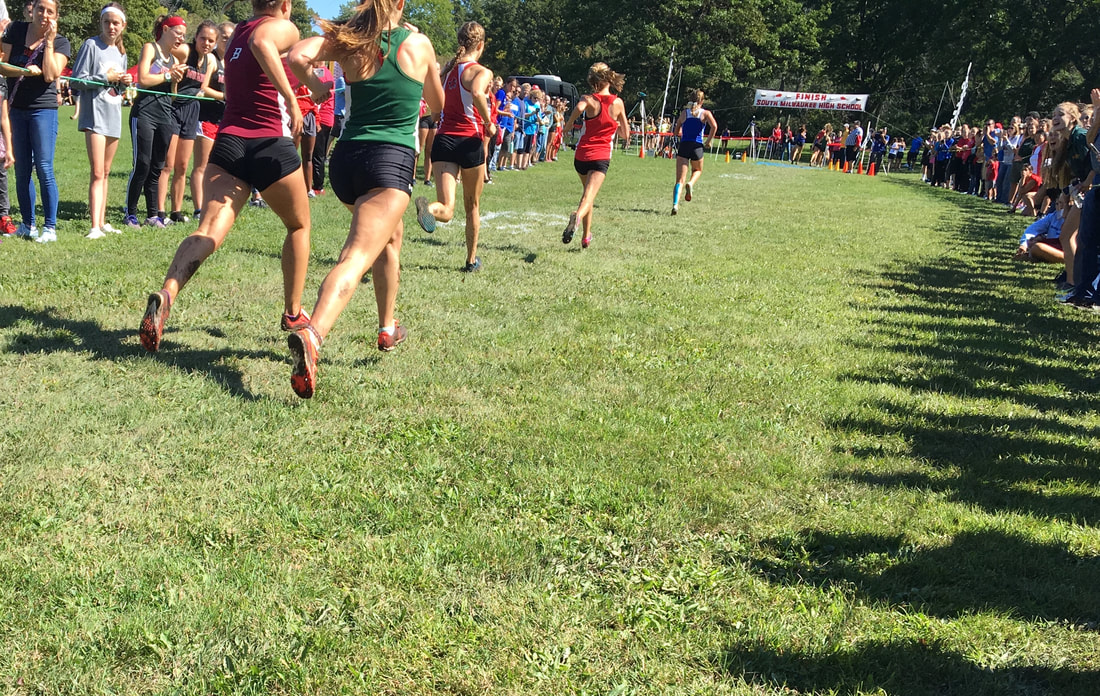
My first planning sketch is the varsity girls running. I chose this picture and cropped it to get a different angle of the runners. This angle is closer to the finish line as you can see in the far top right corner. I wanted to use this sketch because it wasn't just runners and trees but it gave perspective on how close the finish line seems to be but how far it is to a runner.
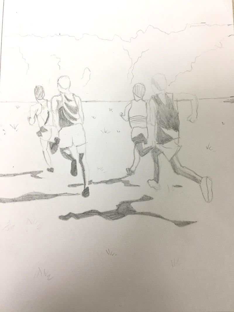
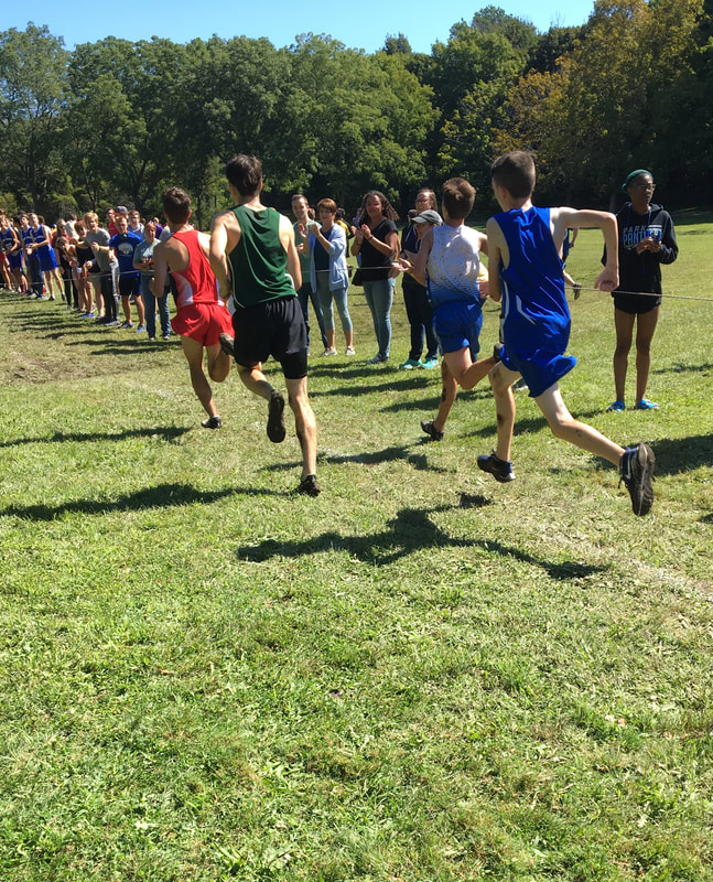
My second planning sketch is from the varsity boys race. I chose this picture because I liked the shadows in the picture and the running forms of each runner. I thought that each runner had a unique form that displayed movement of how fast it becomes towards the end of a race and the "fight" to the finish line. I don't think I will use this sketch because of all of the open space at the top and bottom. The main focus of the piece is all in the middle and it also doesn't show any perspective how I would want it to.
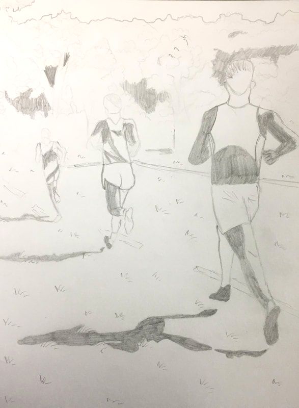
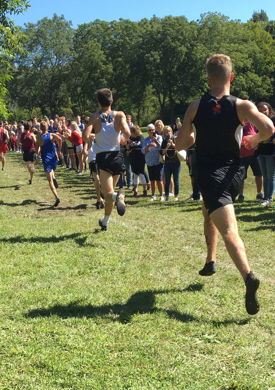
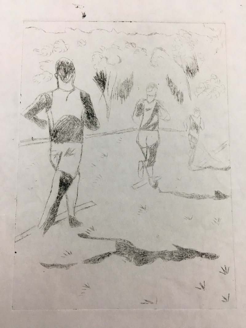
My third sketch is from the same varsity boys race. I chose to use this one for my dry point because of the perspective of the piece. This piece also fills up the space in a well organized way. In this sketch, I recall it, these runners were in the first 20 I plan to use this as my final sketch for my dry point because it uses the space very well, and has enough detail to make the piece finished. This piece shows good perspective since the runners are in a line and follow a one-point perspective.
Process
Experimentation
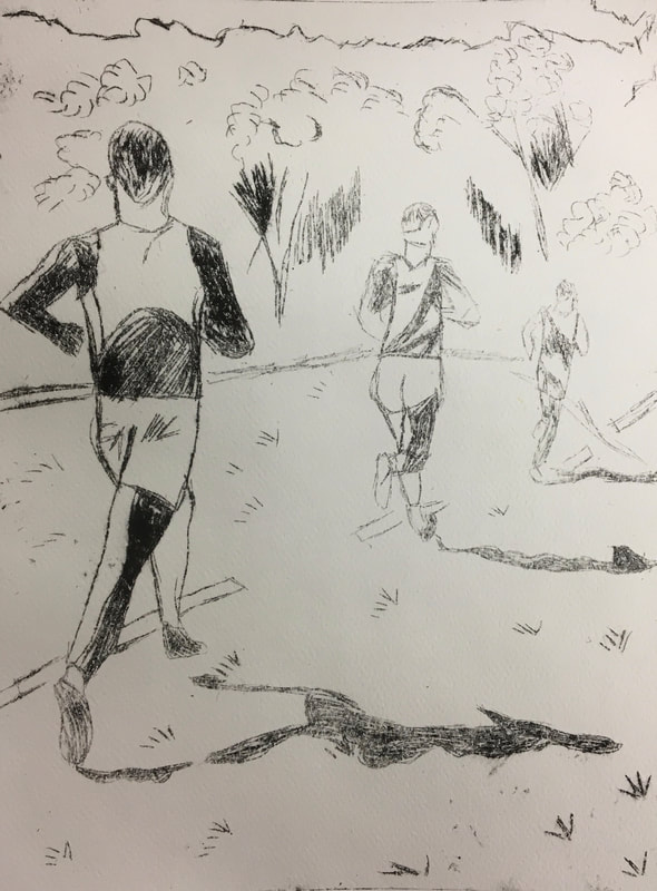
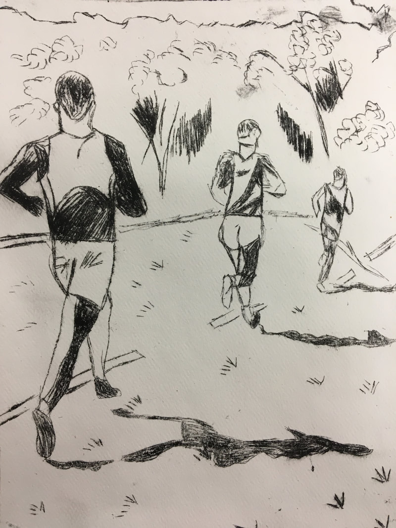
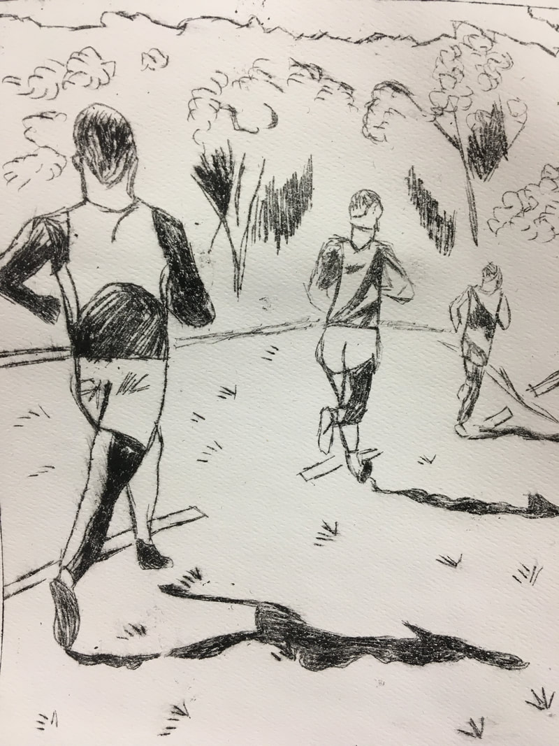
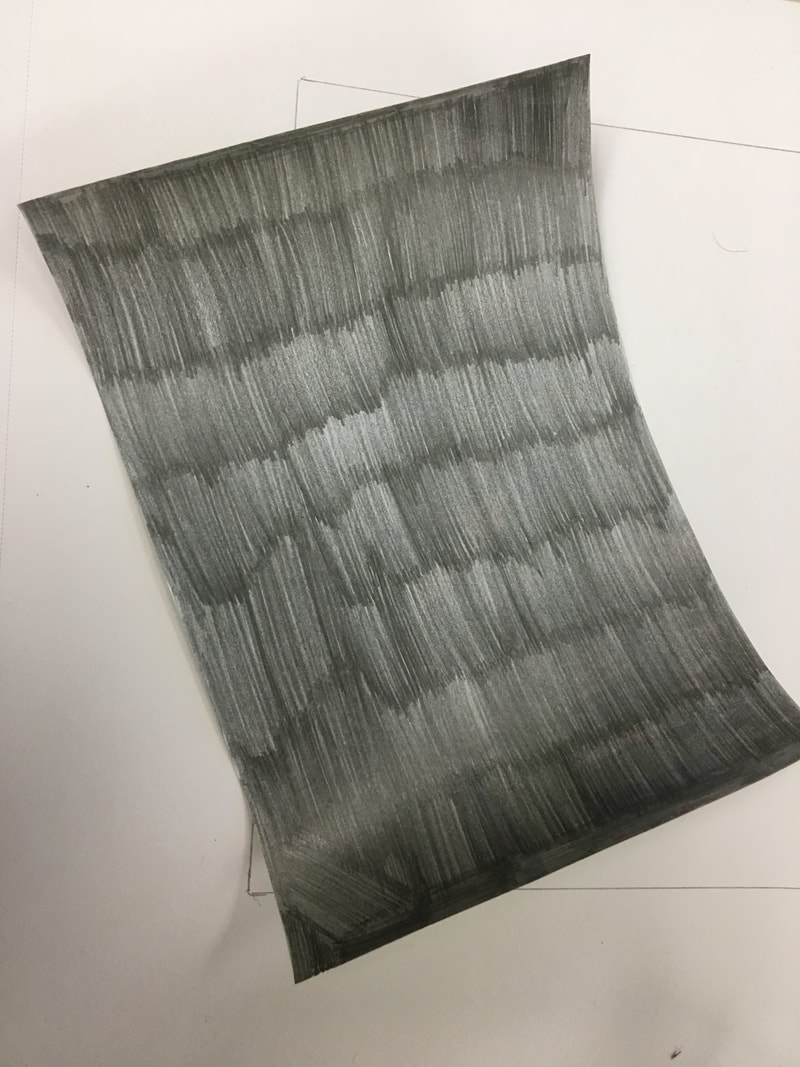
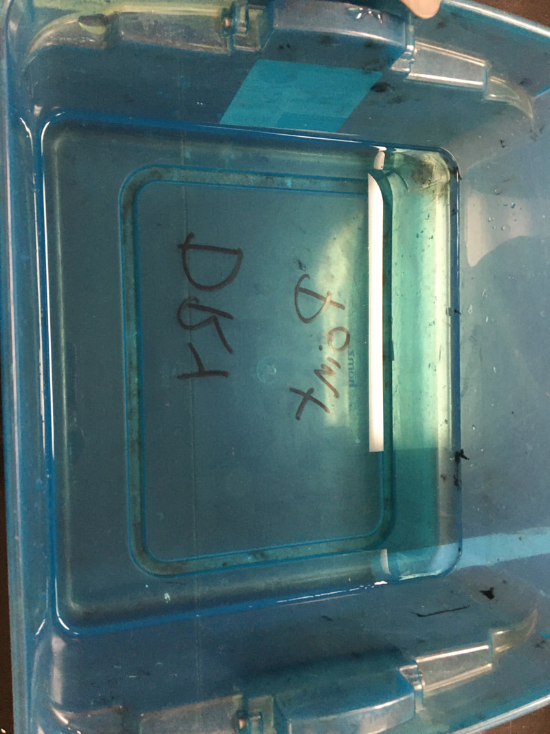
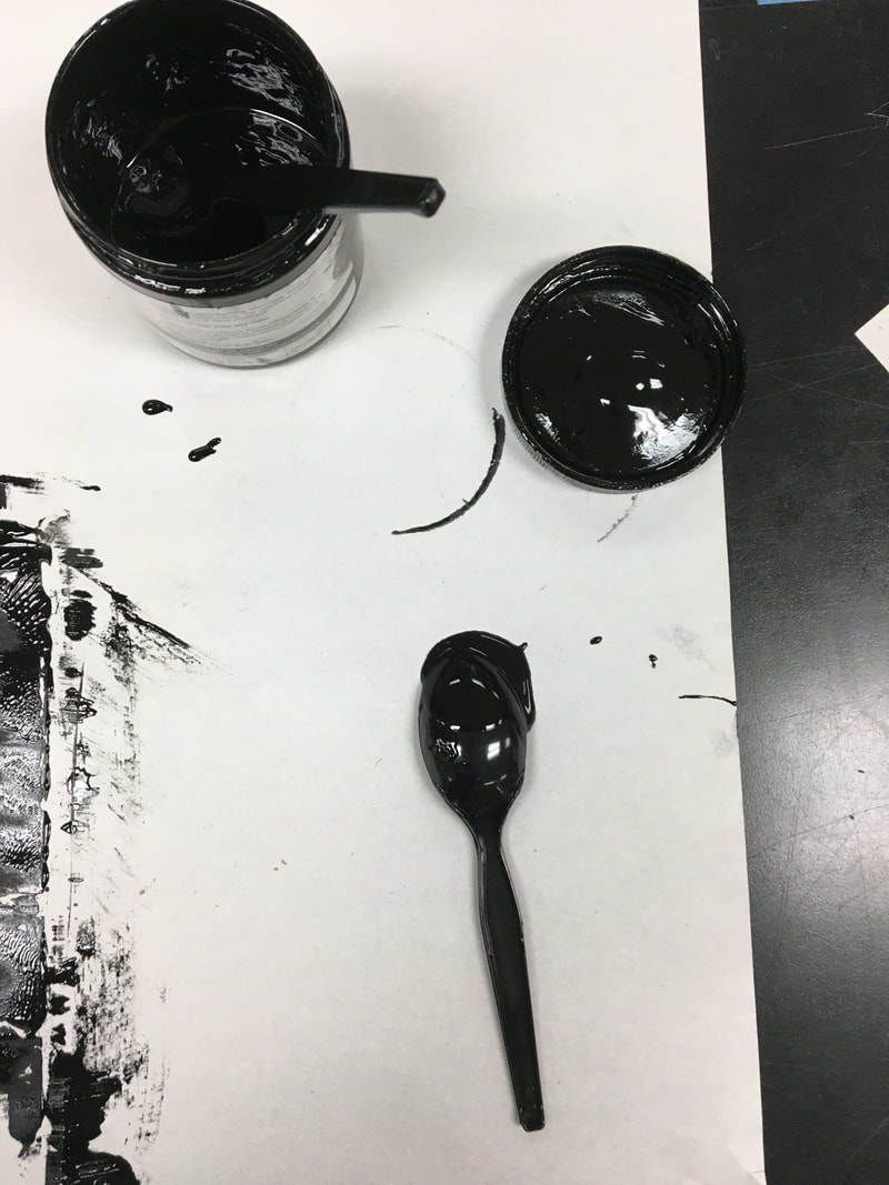
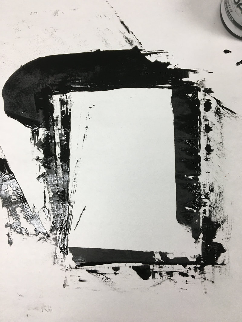
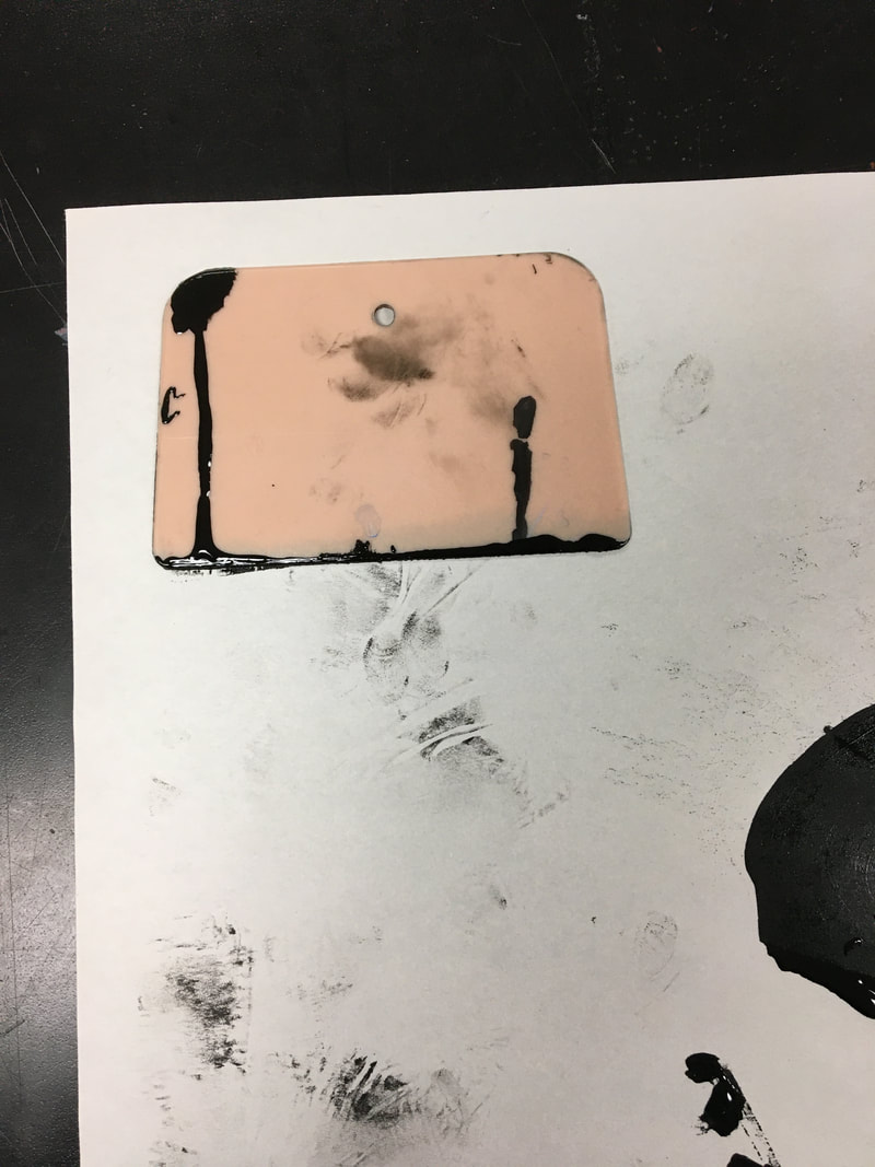
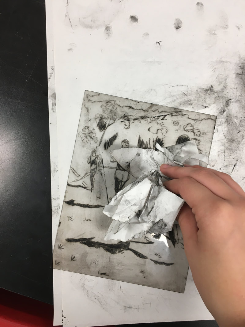
When I first started out making prints, I accidentally used paper that was used for a previous project instead of watercolor paper. I realized it before I made the print, but after I put the oil-based ink on the plate and had it sit in water for eight minutes and dry. I decided to see how it turned out and use it for experimentation. When I finished printing it, the finished print was very light and didn't have the same effect that the watercolor paper had. I also noticed after I made the print while carving I forgot to carve a foot, which is shown in the first picture down below. The second picture is my first official print on watercolor paper, for this print I used the oil-based ink and followed through all the steps. I think while rubbing the ink off the plate, I might have rubbed too deep or I might have not spread all the ink and got it into the lines I carved. There was a lot of excess ink on the top while rubbing and took a lot longer than usual. The third and fourth picture below are my final two, and best prints I made. While making those, I took more time spreading the ink and making sure the negative space was clean so I had the most effective print. When the prints dried, I wanted to use watercolor. While doing the watercolor, I was inspired my Astrid Harrison and how she used color in her piece to represent strength and power. The fifth image is what I originally wanted for the piece, as you can see above for my final piece of artwork. I then thought that maybe it would be a creative idea to paint the sky and the grass that I carved. When I painted the sky, I didn't like it and I continued to paint the grass to try to fix up my mistake. I didn't like it either and it drew the attention away from the runners and their strength that is shown throughout the piece. Luckily, I did this experimentation on my second best print, so I used my first best and did the same thing with the watercolor in that is shown in the fifth picture.
When I first started out making prints, I accidentally used paper that was used for a previous project instead of watercolor paper. I realized it before I made the print, but after I put the oil-based ink on the plate and had it sit in water for eight minutes and dry. I decided to see how it turned out and use it for experimentation. When I finished printing it, the finished print was very light and didn't have the same effect that the watercolor paper had. I also noticed after I made the print while carving I forgot to carve a foot, which is shown in the first picture down below. The second picture is my first official print on watercolor paper, for this print I used the oil-based ink and followed through all the steps. I think while rubbing the ink off the plate, I might have rubbed too deep or I might have not spread all the ink and got it into the lines I carved. There was a lot of excess ink on the top while rubbing and took a lot longer than usual. The third and fourth picture below are my final two, and best prints I made. While making those, I took more time spreading the ink and making sure the negative space was clean so I had the most effective print. When the prints dried, I wanted to use watercolor. While doing the watercolor, I was inspired my Astrid Harrison and how she used color in her piece to represent strength and power. The fifth image is what I originally wanted for the piece, as you can see above for my final piece of artwork. I then thought that maybe it would be a creative idea to paint the sky and the grass that I carved. When I painted the sky, I didn't like it and I continued to paint the grass to try to fix up my mistake. I didn't like it either and it drew the attention away from the runners and their strength that is shown throughout the piece. Luckily, I did this experimentation on my second best print, so I used my first best and did the same thing with the watercolor in that is shown in the fifth picture.
Process
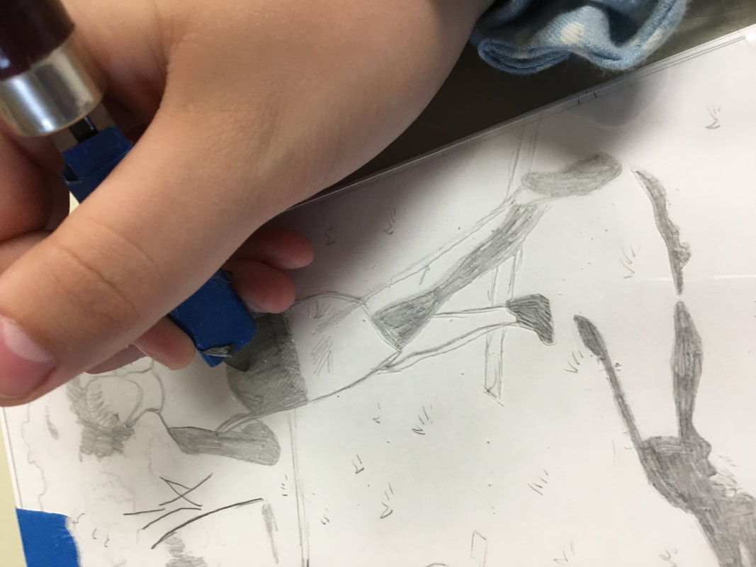
- Since I was using a reference photo, I printed out the photos and I used the graphite transfer method. For each photo, I shaded dark enough so that when I was done drawing it out, it would show.
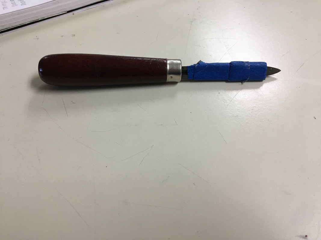
- After I finished my planning sketches, I placed the plate on top of my final sketch. I then used the sharp point tool and carved the surface.
- When I was done carving, I started the printing process
- First I filled a medium-sized bucket with water about a quarter of the way. I placed the watercolor paper in there and let it sit for 8 minutes to let the paper more absorbent to ink.
- While I was waiting for the paper to soak, I placed two sheets of newsprint on the table, one to put the oil-based ink on and one to take the excess oil-based ink off.
- I place my plate on the newsprint, and added a thin layer of oil-based ink using a palette knife. I then used a squeegee to spread the ink across the plate and to get it into the carvings.
- After spreading the ink across the plate, I used scrap newsprint to take off the excess ink. I would gently rub the paper against the plates surface so that I took off the ink that was on the surface and not what I carved. I used circular motions to get the ink off.
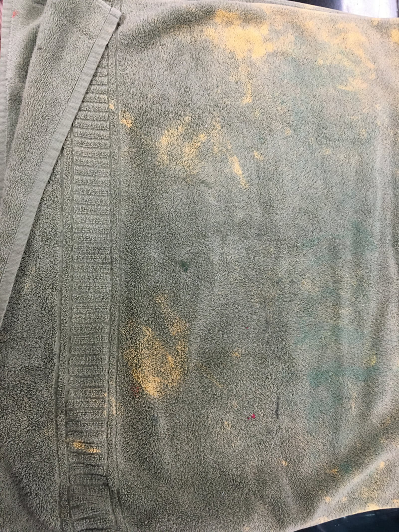
- When the ink was taken off, and when the eight minutes were over, I grabbed the watercolor paper from the bucket and placing a large bath towel on the table flat, I placed the paper on the towel on one end and brought the other end and placed it over the paper.
- I waited a couple minutes to let the paper dry under the towel, when two minutes passed, I placed a new sheet of newsprint on the roller, placed my plate facing up and the piece of watercolor paper on top. I centered the paper on the plate so that it would look presentable. I used the roller and ran through it once, After I ran through it, I gently peeled the paper from the plate and placed the piece of paper on the drying rack to dry.
- To clean my plate, I used thinner since the ink is oil-based and can't be drained down the sink. I repeated steps 4-10 three additional times to get a couple prints.
- After my prints dried, I used watercolor to paint the piece.
Reflection
Overall, I liked how my piece turned out. I think that it represents unity because it shows how all runners go through this same struggle or the same fight at the end of a race and getting to the finish line while trying to pass others. This piece also represents self identity because I myself go through this same fight. I am a runner and even though it isn't me who is running, I chose to do other runners just because I knew there would have been competition within the piece. I like the way I added color and showing the strength and power a runner has at the end of a race to sprint 800 meters can be difficult, but they have been trained to give it their all towards the end and that it isn't over until they cross the finish line. The reason I used red, green and blue for the colors was simply to make each runner an individual. Cross country is an individual sport but also a team sport. Each person has a responsibility, and the better you are, the more of chance you have at winning as well as your team. When you have a strong team, you tend to win, but each person has to individually show that strength.
Compare & Contrast
|
|
Similarities:
|

ACT Responses
1) Clearly explain and describe how you are able to identify the cause-effect relationships between your inspiration and its effect upon your artwork. Edward Borein's piece Sitting Pretty inspired me most and old vintage sport etchings as well. I really wanted to use line in my piece and show the movement of runners. Royal Ascot by Astrid Harrison also inspired me to add color to my piece by using her way of showing strength and power.
2)What is the overall approach (point of view) the author (from your research) has regarding the topic of your inspiration?
Edward Borein captured a lot of his experiences because he traveled throughout the west a lot and was a Western Cowboy Artist. Astrid Harrison created digital photographs that have powerful illustrations of strength and power in them.
3)What kind of generalizations and conclusions have you discovered about people, ideas, cultures, etc. while you researched your inspiration? Throughout my research, I've realized that many people, ideas, culture usually represent something through experience. There is also an overall theme within sports which is strength, that has been around for a long time.
4)What was the central idea or theme around your inspirational research? Strength and unity, the more strength you have, the better you can become with other people.
5)What kind of inferences (conclusions reached on the basis of evidence and reasoning) did you make while reading your research? Some inferences I have made were that when see what's around you or when you have experienced it yourself, you understand it more. Also, the more you experience the more knowledge you obtain.
Bibliography
“Edward Borein Gallery.” Santa Barbara Historical Museum, https://www.sbhistorical.org/edward-borein/.
“Chisholm Gallery.” Chisholm Gallery RSS, https://chisholmgallery.com/astrid-harrisson/.
“Chisholm Gallery.” Chisholm Gallery RSS, https://chisholmgallery.com/astrid-harrisson/.
